Showing posts with label process. Show all posts

Monday, June 9, 2014

A Collier Collaboration

I have enjoyed drawing and painting since I was very young. It came somewhat naturally to me. I had this God-given ability to see in a certain way and think in a certain way that expressed itself in my drawing as a kid. My dad tells of how he used to notice me "really looking" at things I was drawing, and he knew I had it. (I'm sure it also helped that he knew what to look for, since his family was filled with talented artists.) I was by no means a prodigy, but I was one of those rare kids who knew what they "wanted to be" really young, and grew up to pursue it. I am an artist because that is how God made me–I cannot imagine being any other way. In high school and in college, I often didn't feel like I "had what it took" to become a "real" artist or designer, because I didn't live and breathe it or care as much about artists and art history as everyone else seemed to. I was always reassured, though, that even if I quit school, and never entered into the art realm professionally, I would always see and think like an artist. I would still be an artist, so it didn't matter. It also helped tremendously that I have a very supportive family, who encourages me so well.

As I may have mentioned already, my grandpa, Carroll Collier, is a very talented painter. I remember being very young and driving up to Forney, Texas where he and my grandmother live. I remember the door opening and being hit with a very particular scent–one that has oddly become an aroma associated with "home" and "warm" and "love". It's the smell of turpentine (and possibly some other solvents) believe it or not. Both my grandpa and my grandmother, Mildred, have their own studio space in their cozy house. I always enjoyed (and still do!) seeing their newest work, sitting in Gpa's chair, looking at his palette, and studying his reference photos. I specifically remember wondering Why is it so messy? What I didn't know then was that the "mess" was just a palette filled with mixed colors. It wasn't like crayons or markers where each color stayed separate. At that point I didn't know anything about color theory or mixing colors–that I learned in 3rd grade.

I remember by dad teaching me how to draw the proportions of a face, and of a figure, and once my grandpa drew a sketch of my Aunt Debbie using the broad side of the pencil, to show me how it was done. I remember hiding behind the ficus tree in the living room of the first house we lived in and using my finger in the air to trace a top hat someone on the tv was wearing. It had curves. It was not necessarily a box with a line on the bottom, and it blew my mind. I have all these little memories, and they are all so pleasant and familiar, like little treasures.

Something else my grandpa did for me, when I was a kid, was to give me a tackle box filled with oil paints, some of his old brushes, and some canvases. Some of those canvases had incomplete sketches on them...

Like this one:


I painted on and over a few of them, but always saved this one. I've had it for so long (it has to be something like 15+ years), and I was finally inspired to do something special with it. I thought, What if I pick up where Gpa left off? What if I add my own personal touch and make it a "Carroll Collier and Christen Collier Original Still Life? That would be really neat–a joint effort over who knows how many years?!

So I set off to do just that. I photographed a bowl of mine in as similar a position as I could with the closest lighting I could create.


And here's how I put it all together:

I took the original.


I used my new reference photo to sketch in general lines and shapes.


Then blocked in general color and went ahead and blended it a little. Then I let it dry for a few days while I focused on other things.


When I had some more time to work on it, I tidied up some of the highlights and shadows, getting the background pretty close to how I wanted it before adding detail.


 Then I set to work "tightening up" the bowl and fruit. Then I let it dry again.


Lastly, I came back in with the details like that of the cherries on the picnic blanket. I gave the fabric a little texture, particularly in the main shadow crease running from top center to the bottom right corner. I also worked the grapes even further, and did a little on the banana. The bowl and shadows needed a little attention as well, so I paid it to them.


That's where I am so far with this collaborative still life. I'm pleased with it, and it has special meaning to me. What else could I ask for?

Sunday, May 18, 2014

Finished - Jami

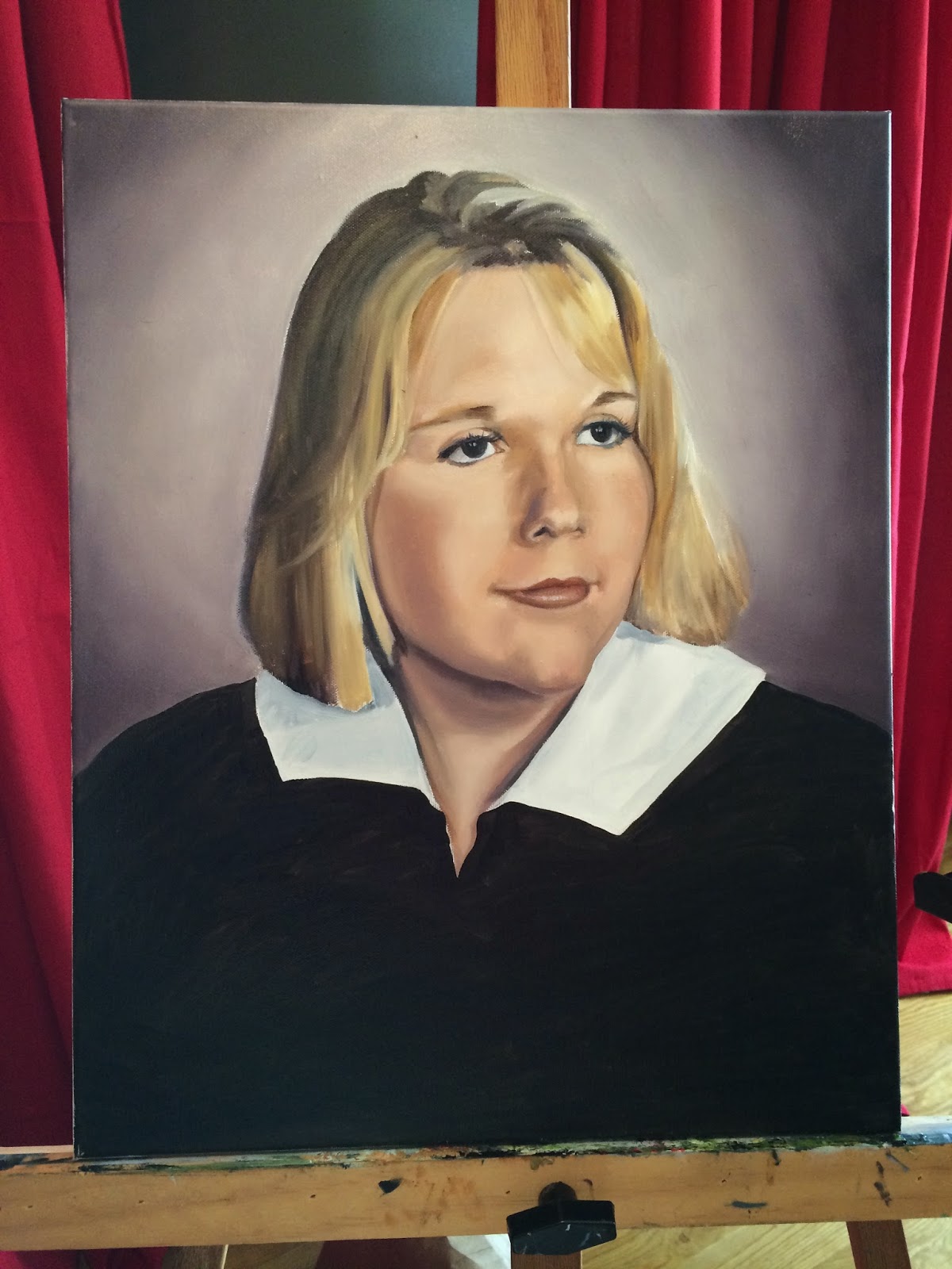
The portrait is finished. Well, I have a few very minor things to do, but not enough to make a difference for this post. I feel pleased with how it turned out, and I hope the whole family likes it.

Let's see, I left off after finishing the general color blocking of the hair. I proceeded to fill in the background next so that the edges of the hair could be worked over it when I went in with the details. I also filled in the general color of the robe and collar she's wearing.


Close to the end, I had a little bit of a panic attack. I had begun adding in her freckles just to realize that she may not even have freckles, and it may just be photographic fuzziness that was making me think freckles. You definitely don't want to give a non-freckle facer, freckles--they no longer look like freckles but pores or zits. So I wrote my client and asked. Meanwhile I was trying to make plans for how to resolve the situation--would I have to repaint the whole face? I was willing, but it was going to be disappointing to say the least.

In response to my question, L says "faint..very faint." I was thinking "oh no!" but then I received another "Nevermind my husband said she had a lot of freckles". Praise God!


So here is the final piece. These photos are all taken on my phone, and while it was still wet, so sorry about the sheen.


I know it is hard to see the details very well, so I've taken a few "close-ups".


Dedicated to Jami and her mother Mollie. 

Mollie, I am praying for your battle against thyroid cancer. 
May God give you true peace and comfort, as well as healing to your body.


Wednesday, May 14, 2014

A Victorious Day

We recently rescued a puppy from a nearby shelter. He's a beagle mix and his name is Rolo because he has the most beautiful milk chocolate and carmel coloring. And as sweet as Rolo is, and as happy as I am to have him, he's really thrown a wrench into my work schedule lately. He's only 6 months, so he needs a lot of training and near constant supervision. All that said, I've accomplished close to nothing, within the last two weeks, on my current commissions.

Earlier this week, however, I began to see signs of a changing tide...this too shall pass. I began to more fully believe there will soon be a time when Rolo will calm his body down enough to play by himself with his toys without needing my attention, peeing on the floor only 10 minutes after I let him back inside, or chewing up something he's not supposed to.

Today was that day, the first of what I hope to be many days where Rolo and I both had our needs met. It didn't look promising at first–it rained all morning and into the afternoon–but I was determined to get some work done and take enough breaks to help Rolo get his wiggles out and help stimulate his brain so he didn't misbehave too badly.

The day is now coming to a close, and I can say with a happy heart that it was a victorious day. I painted almost the entire day, and it was so nice! The kind of nice day that motivates people to use multiple hashtags to describe it– #doggytrainergetsabreak #paintisnotforpuppies #gettingstuffdone

Let's get to business. What I accomplished today:

I am currently working on a portrait of a young lady, Jami, who passed away from cancer (if I am not mistaken). This portrait will be given to her mother, my client's mother-in-law, who is battling cancer right now as well. The pressure is on with this one, and I pray it turns out well for the sake of Jami's memory and also to bless her mother and family.


This is Jami.


Working on her skin. I use a combination of yellow, red, violet and white for the basic skin tone, the shadows usually either lean olive, violet or red, depending on the area. I recommend not using black for shadows--it just makes the colors dull. [Fun fact, I rarely use black at all, even for black things. I do have a tube of black to use on a rare occasion, but I prefer to use a combination of a deep blue and dark brown, it's pretty close to black but you can still manipulate it to be cool or warm.] Really study the shadows and try to find a familiar color in there. I'll bet you can.


After filling in her eyes and eyebrows, she has really started to look like herself. This photo also shows you how I have been setting up lately. I have my husband's iPad on a music stand next to me while I paint. Using the iPad was a tip I received from Carrie Waller, a watercolorist friend, and has proven very helpful because I can zoom-in to a section to see better detail or to just keep from being distracted by a section I am not working on. This is only as helpful as the quality of the photo, however. This particular photo looks alright from the size seen on the screen, but any closer and it is very fuzzy.  


Pushing and pulling with highlights and shadows until I feel pretty happy with it.


It was getting late, but I was itching to block in her hair in general color areas. I move from left to right mainly as a habit, but also because I am right handed and it is less likely that I will smudge paint.


Continuing on the hair. Blonde hair can be tricky because, depending on the light, the shadows can be very deep–almost black. It really tricks your mind because you wouldn't think of using that deep of a color for hair that in person may be the color of gold, but trust your eye and mix the color you see. I mixed a lot of gray-ish yellows, some deep olives as well as browns and near blacks. 


This is how I left it, on this the evening of my victorious day. I am going to bed feeling satisfied and excited to work more tomorrow–if nothing more pressing arises. Good night.

Thank you, Lord, for this refreshingly productive day!


Wednesday, April 30, 2014

Chalkboard Art

I have really enjoyed seeing the interest in chalkboard art grow within the last several years, because the more interest, the more creativity and innovative uses, and the more I see and am inspired by it. There are some really talented hand-drawn type designers/artists out there, and I love seeing their work.

I have been so inspired recently, that I decided to try my hand at chalkboard art. The following two examples are my first and second attempts (I see some improvement already). I thought I'd show you some of my process work, including ideation sketches, well, mainly because these sorts of "behind the scenes" things are my favorite. (I'm a sucker for special features on DVDs too. I could watch the interviews for hours, and I have.) I hope they are interesting to you as well.

Attempt #1: Business Cards

I decided to hand-draw my business card to show that I love to work with my hands, and as much as I do a lot of design work on the computer, I mostly prefer the old analog ways of doing things. There is something really nice about the quality of something hand-drawn or hand-made.

Here's the process: 
First, I sketched out my design on regular old paper–I almost always do this. There are parts of the design process that come together better on paper, and some that come together better in the program. Since this was going to end up being a hand-drawn design, it might as well start that way. Once I got it generally the way I liked it, I made a sketch on the computer to see if what I was thinking would really fit proportionally within the card dimensions. It didn't really, so I changed a few things. Then I used the computer drawing as a template for my drawing. I used black card stock and a "white charcoal" pencil. How is it possible to make white charcoal? It cannot really be charcoal, right?

I transferred my drawing using graphite pencil before I began with the white charcoal pencil. Turns out if you use graphite first, the white pencil will not draw over it. So, I had to erase each letter and redraw it moving from letter to letter, element to element. Again, this was my first attempt at this, I was not expecting to move so slowly, nor was I expecting to have to erase and redraw in this way. But this is how we learn...


Below is the finished drawing on card stock. I then scanned it in and used Vistaprint for printing because the coupon I had cut the price way down, and hey, I'm just starting out on my own. The start up costs are really piling up.


They came in the mail this weekend, and I was stoked! The cropping wasn't great, but for the price, I think they turned out well. I had also hoped to be able to chose a rounded corner option (which I know they had before at some point) but I couldn't find it. Allora, I am content with these.


Attempt #2: Framed Gift

I recently joined the hospitality committee at our church, and the first event I will be helping with will be a thank you and "going away" of sorts for one of the teaching pastors and his family. I'm sure there will be a post in the near future showing all the fun flowers we made out of paper, and maybe even a few photos from the event itself. But this post is about chalkboard art, and so I wanted to share another piece I designed and hand drew as a gift for the family. 

The process:
Again, I started sketching on paper, but this time I didn't do any computer work. As you can see in the image below, I tried to work between individual element inspiration and the larger composition. 


Once I got a pretty good idea of what I wanted, I moved to another sheet of paper to sketch out my final composition to see how it worked. I knew I would still make a few changes during the actual execution, but I wanted to work any major issues out on paper first.


So, I went out and bought a framed picture for $10 from a flea market, took out the artwork, and painted it white. Then I cut some black paper down to size and used the matting that came with the picture to make the border line. Then, using a ruler, I mapped out the ribbon.


Next, the larger words were drawn in, using care not to smudge. I smudged anyway, and had to fix it, but such is life. I finally remembered the old scrap paper trick and used it under my hand when working over the already drawn words.


Then the smaller words and a test to see how thick I wanted the border. You can also see here the scale of the piece.


I was not satisfied at all with the "P" in peace. I must have redrawn it 15 times before I settled on one that I liked. But finally I left it and moved onto the other elements.

The finished piece (more or less):


I framed it and set it behind glass in case the spray fixative doesn't work as well as it should. I'm very pleased with it, overall, and have been seriously considering changing up the look of the header of my blog to reflect this sort of fun style. Actually, I had the idea to change the header before I even did my business cards. But, since I went through with this look for the cards, it only makes sense to give a cohesive look between them and the blog. What do you think?

Saturday, March 29, 2014

Portrait Update

It's time to start adding more detail. This time I pretty much worked left to right, adding highlights, leaves and branches to the background. I didn't want to spend too much time on it, nor make it too detailed and distract from the subject. The background still needs a little attention, but I would prefer to let it dry at this state before tackling it again.


My husband mentioned that it looked like a 2D man holding a 3D fish, and I agreed. It was time to take the plunge and work again on his face. The light source is obviously the sun from above, so his eyes are in quite a bit of shadow. His face ends up being somewhat lit from each side because his white shirt is so reflective. That is also why the underside of his nose and eyebrows are lit. His t-shirt also reflects onto his forearms causing them to take on a slightly different colored highlight on the inner side.

In the below left photo you can see the mid ground plants starting to develop and I also began more focused work on his face.

To the right you can see some beginning work on his hair and I also worked on his right arm (to the left as we look at him). His left arm hasn't been touched except to fill in his wedding ring.


In the Works

Here are a couple of the other paintings I am currently working on. This first one is from a photograph I took in the Tuscany region of Italy near Siena. As you might expect, it was an absolutely beautiful area. We stayed in an agriturismo off the beaten path, which really made the experience wonderful. I am only about 20% of the way into this particular painting, but the general composition is there.


This painting is about 70% of the way complete and is from a photograph of the Dolomites in northern Italy. These mountains are really and truly as jagged and sharp as you see here.  The beautiful fall colors and warm light are the parts that make this painting exciting to me. 


Romans 1:20 

For since the creation of the world God's invisible qualities–his eternal power and divine nature–have been clearly seen, being understood from what has been made, so that people are without excuse.    


Friday, March 28, 2014

Newest Commission

My newest commission is of a man and a fish. I haven't painted many fish before, so I'm interested to see how it goes. It's a beautiful fish, and of high importance in this painting, so I want it to look as slimy as it really is. Wish me luck!

First things first. I drew my initial sketch–these sketches always look weird, and I've had to learn to trust my instincts and that it will eventually look right. The lines locate boundaries, and do not represent the tone within the boundaries, which means they never allowing the initial sketch to look much like the person. For instance, without darkening the eyes, he looks very odd. For this sketch in particular, his hands were the odd part. A cocked wrist and turned fingers plus the foreshortening of the arms made for a funny initial sketch.


You can see that I divided my canvas into 16 sections. I use these as reference lines to get the proportions right. 

When I begin painting, I almost always start by adding the darks, or at least the darkest shade in each area. I'm just trying to lay down a foundation. After this dries, I'll do some pushing and pulling on top. The hardest part of the whole process for me, is staring at white canvas. His shirt is white in this painting, so I'll leave it exposed for now (so I don't mess it up as I go), but for the most part, I like to fill the canvas with paint as soon as possible.


Just filling the canvas with general color areas. I like to work from loose to tight, and oil paints lend themselves to that nicely. 


Again, basic color areas. Faces get a little more attention in this "basic color" stage, just because I don't want to lose the boundary lines I drew in my initial sketch. 

More to come with this painting. Stay tuned.